Archive for the ‘metal’ Category

h1

A compact gallery of progressive metal design: Justin Bartlett

December 31, 2009

Illustration for The Secret, by Justin Bartlett


The exploration of contemporary heavy metal design continues apace; why not end the year with a round of intense, detailed yet schematic, patently evil illustration?

This work, by the formidable Justin Bartlett, is not an explicit comment on the collective state of mind at the turn of oh-nine (unless you’re vibing that way, go there!). My research agenda includes advocating for the design subcultures that unaccountably persist in this visually omnivorous era. Music graphics are still a key source of graphic innovation, despite assertions to the contrary (confusingly, by the very designers who paved the way, like Peter Saville). Even in the vaunted iTunes era, a band’s visual output—identity, standard and limited-edition packaging, merch, etc.—can still be central to a band’s whole being; as listeners, we still mentally append images to the otherwise imageless, yet evocative, music.

For more extreme musics, this is moreso. I wrote a piece about progressive heavy metal design for Print, which I derived from an earlier podcast I produced on the subject.

Featured in the article are Stephen O’Malley of SUNN O))), Aaron Turner of Isis, and Seldon Hunt, a trio of excellent designers who occasionally contribute to each other’s projects. Also quoted are Ian Christe, author of the excellent Sound of the Beast: The Complete Headbanging History of Heavy Metal and publisher of Bazillion Points, and Mike Essl, head of Graphic Design at Cooper Union. The Print piece doesn’t include links, so I took the opportunity to correct that here.

This is the first of a short series of compact portfolios of the main artists mentioned in the piece. As he said of the article on his blog Vberkvlt, “I will NOT be exiling Satan any time soon…” Justin’s high-contrast, pen-and-ink work is thematically perhaps in the most trad metal vein—corpses, goats, 666, Petrine crosses, and pentagrams abound. But the starkness of the work—the way the iconically occult figures stand solitary against the field, as in Aubrey Beardsley’s work—contributes to its ambiguity.

Justin is featured in the latest edition of Taschen’s Illustration Now series, and you can read an interview with him in a recent ILOVEFAKE (it’s a PDF). Plus his links page is an excellent resource to more amazing design and illustration.

Broad as it is, the graphic work featured in my article does not represent all the bewildering strains of metal design today; like the music itself, the design and illustration splinters in a hundred other directions. But as the Print article shows only a small sliver of the work mentioned, it makes sense to give a more extensive gallery here. Of course, the designers’ sites themselves are worthy of more exploration.

Justin Bartlett

AwayInMyHypergrave

Cthonicrites

Raven

Pakt

draggedIntoMoonlight

TheSabbath

DarkFolke

Mindroots

Captions for the work above:

1. Away In My Hypergrave
2. Cthonicrites
3. The Raven
4. Pakt
5. Dragged Into Moonlight
6. The Sabbath
7. Dark Folke
8. Mind Roots

Earlier: The look of metal today

h1

Grant Willing: Svart Metall

July 31, 2009

claw

Grant Willing’s ongoing photographic series Svart Metall is a meditation on the ineffable qualities of an unsubtle musical subculture. “Svart Metall” is Swedish for black metal, and if you want to know more about that let me Google that for you. Though its sonic qualities are challenging even for some metalheads, its Nordic atmospherics and paganistic themes are arguably evocative for a diverse range of artists.

Grant created this body of work as his thesis at Parsons, and won “Best in Show” in the 2009 Photography Thesis Exhibition. He published it in an edition of 1000, also entitled Svart Metall, available through his site and Photo-Eye. The photographs are allusive of the themes black metal culture treats, and presented in a surprisingly informal way—printed on bleached newsprint stock (something of a trend? See Alec Soth’s The Last Days of W). On this ephemeral paper, the photographs retain a stately quality but gain a more disorienting sense.

Distinctive aesthetic expressions of metal are of interest on this blog, of course. But I also saw a (loose) parallel in how this American artist interprets visual genres forged in northern Europe and the original dissemination of the music itself, which spawned numerous stateside Black Metal bands. Overall I wanted to know more about  the motivations and process behind this fascinating body of work. I emailed Grant before he made a trip to Sweden and Norway to continue this series.

How did the project begin?

I was kind of stuck working on another project, Grand County [also viewable on Grant’s site] and felt like I needed to take a break from that. I had an idea for a while to do a project on Black Metal or something related to Norse Mythology, Paganism, Satanism, the Occult, etc. etc. I’d been kind of secretly fascinated with this stuff since high school and felt like it was time to do an “artistic investigation” into this.

I started actually working on the series when I took a trip in 2008 to Pennsylvania. I think I just had all of these ideas for different images coming through my head at that time and began shooting in that type of style and mindset.

moon blackmurder

I am interested in how relatively nonrepresentational and atmospheric the work is—which is of course consistent with a lot of the work that has appeared on black metal packaging. But it’s 180 degrees from, say, Peter Beste’s work [as seen in his book True Norwegian Black Metal].

I really like Peter Beste’s work and think its great how he does these intense studies into subcultures that have such a sense of awe or mystery surrounding them.  But yes, like you said, my work is totally different. I feel like his work is kind of the front-end of black meta—the performances of the musicians, how they want to look in front of the camera, carefully crafted situations, etc. My work is kind of like the back-end—what is behind the music.

Are you interested in Black Metal in all aspects, or just this aesthetic vector? That is, are you a fan who wanted to artistically explore this world, or is this new to you?

Like I said before, the series is a result of a long time interest in this kind of music and its ideologies. I’ve been listening to Metal for as long as I can remember, but when I started listening to Black Metal it was the first time it really interested me so much more than just the sound itself—the culture and history behind the music are what interest me most I think.

axe fortun

This was your Parsons thesis—and congrats on the award and fellowship. It was well received at school then? Who was your advisor? Any resistance to the project academically?

My advisor/professor for the past year at Parsons was Carrie Levy. She was incredibly helpful and gave me the best insight to my work that I received at school. Initially there was a small amount of resistance to the work mainly because we weren’t sure I was going to arrive at a resolved point in the work by the time I graduated. But this series developed a lot more quickly than some of my past work, I think because it’s something I had been thinking about for a long time and a subject I was already obsessed with.

How do you see this work tying into the larger metal-oriented art scene, from the fine-art, Banks Violette end of the spectrum to designer/musicians like Stephen O’Malley and Aaron Turner? Or do you see your work as its own thing?

I definitely gained inspiration from those artists, especially Banks Violette, but I think my work differs in the actual subject matter I’m looking at. I think for the most part these other artists are making work that directly references metal genres, but my work is referencing more what is referencing the music itself. I’m using Black Metal as an umbrella term in a sense, as a way to group together these different ideas, such as Paganism, Satanism, Norse mythology, etc. into a concise body of work. When taken out of the context of Black Metal, Paganism and Satanism alone are fairly different from one another, but they are grouped together in the sense that they provoke a similar mental image and are “occult.”

whitesun blacksun

Curious that you are continuing the project in Sweden and Norway—were any of the photos from the first part of Svart Metall shot there? I’d guess not all of them—if any of them—were taken in Scandinavian countries.

None of the photos in the series have been taken in Scandinavia so far (with the two exceptions of the found images “Fortun” and “Mannduad”). I started working on the project in western Pennsylvania—the first image of the series, “Untitled (Moon)” was one of the first images made for Svart Metall. Almost half of the images were taken in the mountains of Colorado. The rest were taken in New York and Québec.

mannduad fire2

For that matter, since the project eschews a considerable amount of literalism anyway, why is it important to actually go Nordic with the next part of the project—or any of it?

I think its important to visit these areas, Norway especially, in order to bring a sort of change to the work and have almost a fresh start again. It’s also undeniably something I want to do regardless of the work I make there—but my main objective is to see these places that have sparked what is essentially behind or responsible for provoking the rise of Black Metal, its culture, etc.

How do you plan a trip like this, how do you do location scouting ahead of time? Do you know what you are looking for, or do you go more instinctively?

I’ve only planned this trip so far in that I’ve booked train tickets to a few different places in Sweden and Norway. But mostly I’m going on instinct and off of some research I’ve done. It’s similar to the way I would shoot in the US: I choose an area based on the connotations it has or my impressions of it and use those ideas to find something in that place. So in a way I have ideas in my mind that I’m looking for, but they’re not necessarily location specific.

ice fenrir2

You are still working on Svart Metall; what are your ultimate plans for the project?

My ultimate plans right now are to keep transforming the series into an even more personalized look at black metal. It’s a really general desire, but I don’t want to pin down too much where I want it to go, I think it works best when it evolves naturally. I have a few ideas in mind of where it could go in terms of presentation, etc. but I’m hoping those ideas will also change over the course of the next year or so.

sword
The photographs above are not titled in the Svart Metall book, but they are, in order here:
Untitled (Claw)
Untitled (Moon)
Untitled (Black Murder)
Untitled (Axe)
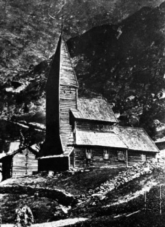
Untitled (Fortun)
Untitled (White Sun)
Untitled (Black Sun)
Untitled (Mannduad)
Untitled (Fire II)
Untitled (Ice)
Untitled (Fenrir II)
Untitled (Sword)

Earlier: Helvetica metal, The look of metal today

h1

Thunderous, resonant

July 8, 2009
Attila Csihar from <i>Monoliths & Dimensions</i> liner. Cyanotype by Mathilde Darel.

Attila Csihar from Monoliths & Dimensions liner. Cyanotype by Mathilde Darel.

Monoliths & Dimensions is coursing through my head, and I am not listening to it. I posted some extremely impressionistic notes taken during a listening preview of this newest SUNN O))) release, which fell far short of a review (so I didn’t call it a review). But it’s staying with me and I’m compelled to write more about it.

On O’Malley’s blog (scroll way down to June 11 entry), I read an interview with Attila Csihar, whose vocal presence on the album may be the single most deranging element of the entire effort. In the interview, Csihar confirms a few intuitions I had about his extremely affecting, otherworldly utterances, establishing a surprising link between this recent doom opus and several key industrial bands. “Surprising” because though it is now more common to hear it talked about as an inclusive genre, metal is still a movement with a strong sense of aesthetic purity.

However, if your flavor of extreme music tended toward the industrial, as mine did in the 80s, then underneath SUNN’s eruptive chords you will hear shades of Skinny Puppy, Coil, and even Laibach in some of the textures, instrumentation, and pacing of the album.

In particular compare “Choralone“ from Skinny Puppy’s 1989 release Rabies with SUNN’s “Agartha.” Of course Ogre’s vocals are heavily processed, and Csihar’s are not (or perhaps not nearly as much—more on that below). And try Coil’s “Cathedral in Flames” next to “Hunting & Gathering (Cydonia).” But it is hard not to think of the radically basso delivery of Laibach’s Milan Fras when listening to the first track, “Aghartha.” When the interviewer apparently cites Fras, Csihar explains the link:
“I was inspired by Laibach while I did those vocal lines,” he says. “I didn’t know that it was that obvious, but that’s great. I was always amazed by Milan’s voice, how he could go that deep down, and it took me many years of practicing to be able to do that. Laibach was one of my biggest inspirations back in the ‘80s, besides Current 93, Skinny Puppy, Front Line Assembly, etc. And of course, some extreme underground metal bands like Celtic Frost.”

The first words on the album are, “Thunderous, resonant.” Attila Csihar, Milan Fras.

Original interview at CleveScene.

Earlier: In lieu of a review: SUNN O)))’s Monoliths & Dimensions, The look of metal today

h1

Helvetica metal

June 4, 2009

MOP

More evidence that workhorse sans serifs can transform even the humblest of thrash epics. This conceptual heavy metal graphic design project comes in the form of Metallica’s 1986 opus Master of Puppets processed in the title identity through the great leveler, Helvetica Franklin Gothic (see update below).

Noah Venezia, whose projects include the enigmatic Stupendous, has alchemically distilled the sleeve material of Master into a Swissly modernized poster. This approach isolates the text component of the album’s packaging, disorienting it in its degenrefication. It would be condescending to the original album to suggest this is an improvement; it’s apples to invisible oranges. (Master’s cover art was executed by the late Don Brautigam, whose Stephen King covers for Night Shift and The Stand, linger durably in my memory. Compared to what Ed RepkaDerek Riggs, and Joe Petagno produced the same year,  Master of Puppets is the quintessence of subtlety.)

The original vinyl Master of Puppets packaging (European issue), via Johan’s Metallica collection site

The original vinyl Master of Puppets packaging (European issue), via Johan’s Metallica collection site

Of the project Noah says, “Master of Puppets had a tremendous impact on me during my formative years. It was unlike anything I had heard and I became obsessed with it. People that I talk to either share a similar experience or it means nothing to them.

“My redesign of the liner notes was an attempt to glorify the album while also making it more acceptable to those unfamiliar. I wanted to compress it into a format that people did not question. I also wanted to make it more powerful simply by increasing its scale. It’s a sort of homage to the album.”

UPDATE: That is indeed Franklin Gothic. Though the main point adheres: it’s compelling to envision heavy metal through the conventions of modernism and clean type. And the pun in the hed is too good to ditch.

Noah says the poster will be on display at the new art + performance space Littlefield in the Gowanus neighborhood of Brooklyn on Friday, June 19.

Earlier: In lieu of a review: SUNN O)))’s Monoliths & DimensionsThe look of metal today

h1

ln lieu of a review: SUNN O)))’s Monoliths & Dimensions

May 17, 2009

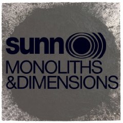
sunncover

Given New York magazine’s profile of SUNN O))) upon the occasion of their Monoliths & Dimensions release, it’s fair to say that Doom, a formerly peripheral metal subgenre, has mainstreamed. A slight discomfort arose in this, and not just in recognizing myself in the predictable demographic slot of SUNN fans (musically omnivorous, mid-thirties, not seemingly a very metal dude). It’s the overprotective feeling fans get when their objects of devotion get that dreaded syndrome known as “exposure.” They’re going to get it all wrong, the avaricious part of the brain says. They may listen, but they won’t really hear.

I had the pleasure of previewing this album in a recording studio in DUMBO a few weeks ago. My professional interest in SUNN currently revolves around a piece I’m writing for Print magazine about contemporary heavy metal design, which will feature the graphic work of SUNN cofounder Stephen O’Malley, Isis and Hydra Head records frontman Aaron Turner, and designer/illustrator (and much more) Seldon Hunt. And though I no longer review music or profile bands, it was a music journalist preview, and old habits die hard. In lieu of an actual review, here are some impressionistic notes I took there as the multivalent and very loud currents of sound emanated from the well-calibrated studio monitors. The album’s nearly hour-long duration collapsed, and I entered an ambiguously deranged headspace. References below include: SOMA = Stephen O’Malley, Attila = Attila Csihar, former Mayhem vocalist and SUNN collaborator, and references to old-school industrial bands Coil, Laibach, and Skinny Puppy (surprising associations which SUNN fans may not appreciate). The notes below are numbered one through four corresponding to the album’s four tracks: Aghartha, Big Church [megszentségteleníthetetlenségeskedéseitekért], Hunting & Gathering (Cydonia), Alice—yes I just cut and paste those titles:

8 dudes and one girl waiting for doom.
Richard Serra as front over art. SOMA really going for the art
1. —midchord eruption like a lawnmower engine
chord progression actually faster than usual
Attila vocals from outer space. I think he said “Satan.” What other background chaos can come up against the guttural wall than the squealy-mouse running pick on guitar string effect?
-Laibach-
It’s turning into Scatology-era Coil, even Skinny Puppy atmospheres (“Reclamation”). Industrial undertones-noise
The horns, what are the horns?
-panicky @ that point
2. choral! Then the chord eruption-
two punctuated silences with bell. Abrupt end, just falls off a cliff.
3. like lo-fi SUNN coming over bad reception until-
horns very Fairlight–Coil, textures like “Cathedral in Flames”
* coming together on this one *
4. Modern classical tradition–horns dissolve, harp, plucked strings

Maybe that comprises a review after all. For more go check out interview transcripts from the world’s best music magazine, The Wire.

Earlier: The look of metal today

h1

The look of metal today

March 30, 2009

Seldon Hunt's treatment of Isis for Revolver magazine

Seldon Hunt's treatment of Isis for Revolver magazine

This audio piece is part of an ongoing research project about contemporary heavy metal graphics. It was my final project for the D-Crit podcast workshop taught by Studio 360 host Kurt Andersen and producer Leital Molad. That I could learn the requisite recording and ProTools chops—and perhaps moreover to overcome the anxiety that went with it—to produce this piece was miraculous enough. It’s still rough; I’d redo a few things, but the basis is well enough there.

SUNN logoFor this piece I had the privilege to interview two great contemporary designers, Stephen O’Malley (avant-metal master of SUNN O))) and other influential doom and experimental projects) and Seldon Hunt, whose photography, illustration, and design graces packaging and tee-shirts for Isis, Neurosis, Nadja, and many other bands. I also talked to Mike Essl, head of graphic design at Cooper Union (and who I got to work with on this survey of lowbrow art), and Ian Christe, author of the excellent Sound of the Beast: The Complete Headbanging History of Heavy Metal and publisher of Bazillion Points.

Bazillion Points logo

The argument here is not just that heavy metal isn’t all Blackletter and horrorshow graphics; it’s that some of the most compelling design today is coming out of this world. It’s weird to me that this much innovative visual output goes virtually unnoticed in the design world. More on this subject, anon.

The look of metal today (about eight minutes long).