Archive for the ‘printed matter’ Category

h1

Prompts 7.3.09

July 3, 2009

HIStory teaser

° This tour teaser, shot in 1995 in Budapest, was directly referencing Triumph of the Will per MJ’s wishes. There is more footage rumored to be buried, and a little more here.

Hin Chua

° An amazing-looking, at times startling, photography show about food curated by Melanie McWhorter, and including the work of no fewer than three Hot Shots.

MGwithpage

° The difficult genius of Michael Gira now migrates from music and words to a twenty-drawing portfolio.

ebm

° “It’s been great for building community.” The vaunted Espresso Book Machine, blogged here earlier, is one of the last independent bookstore employees left. Check out the video, they managed to make print production rather dull. Via Ted Weinstein.

x_invite

° Adam Michaels of Project Projects launches X, a document of the trajectory of the X symbol within (and without) underground music culture. Exhibition is already over but phase one, a book of initial visual research, is available.

° Last, Darius Himes is always talking about what makes a good photo book. And is dead-on.

h1

Helvetica metal

June 4, 2009

MOP

More evidence that workhorse sans serifs can transform even the humblest of thrash epics. This conceptual heavy metal graphic design project comes in the form of Metallica’s 1986 opus Master of Puppets processed in the title identity through the great leveler, Helvetica Franklin Gothic (see update below).

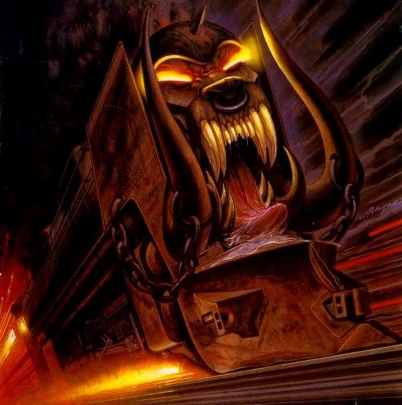
Noah Venezia, whose projects include the enigmatic Stupendous, has alchemically distilled the sleeve material of Master into a Swissly modernized poster. This approach isolates the text component of the album’s packaging, disorienting it in its degenrefication. It would be condescending to the original album to suggest this is an improvement; it’s apples to invisible oranges. (Master’s cover art was executed by the late Don Brautigam, whose Stephen King covers for Night Shift and The Stand, linger durably in my memory. Compared to what Ed RepkaDerek Riggs, and Joe Petagno produced the same year,  Master of Puppets is the quintessence of subtlety.)

The original vinyl Master of Puppets packaging (European issue), via Johan’s Metallica collection site

The original vinyl Master of Puppets packaging (European issue), via Johan’s Metallica collection site

Of the project Noah says, “Master of Puppets had a tremendous impact on me during my formative years. It was unlike anything I had heard and I became obsessed with it. People that I talk to either share a similar experience or it means nothing to them.

“My redesign of the liner notes was an attempt to glorify the album while also making it more acceptable to those unfamiliar. I wanted to compress it into a format that people did not question. I also wanted to make it more powerful simply by increasing its scale. It’s a sort of homage to the album.”

UPDATE: That is indeed Franklin Gothic. Though the main point adheres: it’s compelling to envision heavy metal through the conventions of modernism and clean type. And the pun in the hed is too good to ditch.

Noah says the poster will be on display at the new art + performance space Littlefield in the Gowanus neighborhood of Brooklyn on Friday, June 19.

Earlier: In lieu of a review: SUNN O)))’s Monoliths & DimensionsThe look of metal today

h1

49 Cities

May 20, 2009

Wednesday, May 20 sees New York’s Storefront for Art and Architecture host Dan Wood and Amale Andraos, principals of WORKac and authors of the new book 49 Cities in conversation with esteemed Archigram alumnus Mike Webb.

The 49 Cities exhibition is up for just a few more days, and is highly recommended. Andraos and Wood applied their research prowess to process 49 speculative city schemes through statistical models to yield best guesses at how they would really look and operate in the real world. “Some cities were built in one form or another,” they write, “but most of them remained on paper. And yet today, many of them have indelibly influenced our global urban landscape.”

49 Cities at the Storefront for Art and Architecture

49 Cities at the Storefront for Art and Architecture

The book should be an enduring touchstone for speculative architecture enthusiasts, not least because these often fantastical projects still fire the imagination even—or especially—when seen through the sober lens of land use apportions, population densities, and scaled plans. The distinction among fact and fiction is less important here than the realization that every city is an idea, however unconscious or shortsighted, before it is built. “While the repercussions of Radiant City, Broadacre City and Garden City have been widely acknowledged, it is interesting to compare recent developments in China and the UAE to some of these visionary plans, ranging from the more utilitarian to the more exuberant.”

For those who can’t make it to the event, I’ll endeavor to report back with any amazing snippets from the discussion—or get the book. The slimness of the volume belies the concentration of revelations within.

h1

ODB has mysterious plan to slay trad(e) publishing

March 22, 2009

Henrik Drescher recently reminded me that books are dead. This is bad news, because we made two good ones together, and if he’s right, they were perhaps his last.

Unless, unless! He advised me to look up “espresso book machine.” What I got is ODB. No, not ODB, not even fauxDB, but rather On Demand Books: “What Gutenberg’s press did for Europe in the 15th century digitization and the Espresso Book Machine will do for the world tomorrow.”

ODB!

ODB!

I’ve been waiting for the day when I could trade the experience of asking a bookseller, which I was off and on for five years, for asking a barista to get me something “identical to factory made books” to read.

But of course nothing like a coffee bar is being proposed here. There’s so much about this site that seems iffy—not least the baffling line quoted above (crucially missing comma), and the bewildering lack of branding sense in calling this thing the “Espresso Book Machine” (or is it an “ATM”?)—that I’m trying to find out more about how this company endeavors to change the book market. Rather than contribute to the ongoing register of apocalyptic signs about the publishing industry, I just want to investigate this joint further to see where it leads.

The Espresso Book machine, via SuperlativeQuip on Flickr

The Espresso Book machine, via SuperlativeQuip on Flickr

On-demand publishing is not new, and companies like Blurb and Lulu have been pushing the envelope of color reproduction and visual publishing for years. But putting these machines in a few libraries here and there doesn’t seem like the model to vanquish trad/trade publishing.

This article from the Chronicle of Higher Education seems to have the best recent assessment of ODB’s endeavors. What else do you know? Anyone see this thing in action at the NYPL in 07?

h1

This is the way to blog books

March 9, 2009

Shawn Hazen, the preternaturally talented Chicago-based designer, has begun to blog books based on their design-intensive covers. This bugs me, because I’m soon to do similar, and I fear Shawn’s doing it better.hazen-booksBut that’s okay, because <full discosure> Shawn and I have collaborated fruitfully over several amazing projects. His selections are aesthetically stirring, and demonstrative of the transitional sixties-eighties era that is still deeply underexplored. I can’t wait to compare his book posts with mine.

h1

The Shape of Time

March 6, 2009

On Feb 24 David Reinfurt, copropietor of “Just-In-Time Workshop & Occasional Bookstore” Dexter Sinister and journal Dot Dot Dot, was the first to disquisite at the 2009 D-Crit lecture series (curated by us students–good on ya Fred + Katie). Two items of significance–if by significant I mean of primary interest to graduate students–transpired.

First, I think I finally get Dot Dot Dot a bit more. David’s preoccupation with modes of information generation and dissemination is the basis of the content. Oh and the cover of #17 is an outtake of #16’s Genesis P-Orridge sitting. There, I sewed it up for you.

Second, I had been banging my head against the wall to find some underpinning for an exhibition concept, something about recursive time in the design history and morphology. Eternal return wave theory not particle theory yadda yadda. David pops up a slide of the cover of a book, The Shape of Time: Remarks on the History of Things by George Kubler.

I’m still going through the book and enthusiastically taking passages out of context to suit my ends. “No formal sequence is ever really closed out by the exhaustion of all its possibilities in a connected series of solutions”–perfect. The influence of this academic book seems to put it in a league with others that broke out of their primary categories and into the broader intellectual ferment of the sixties–think Banham’s Theory and Design in the First Machine Age, Venturi’s Complexity and Contradiction in Architecture, McLuhan’s Understanding Media. Beyond helping with this curatorial concept, it will be another node in my disorganized considerations of time.

Perhaps not unrelated in this regard is my observation that the older cover The Shape of Time blows away the new one.  shapeoftimenew

h1

Radial time

March 3, 2009
Muji Chronotebook

Muji Chronotebook

I am not here to praise Muji; they don’t need it. Yeah yeah it’s hard to resist their  accessible minimalism. I too wish I could wear grey, black, and white as my austere uniform every day, but can’t pull it off.

But their Chronotebook is notable in its simple tweak of the rectilinear grid that defines most diaries. These pages are radial: each day is represented by a spread with a circle on each page, the verso for AM and the recto for PM. It’s truer to the way we usually visualize time, as a clock face rather than graph paper. Thinking about time differently is a worthy endeavor, and it can start here.