Archive for the ‘design’ Category

h1

Emergence

June 3, 2010

This blog originated as part of my classwork in pursuit of an MFA in Design Criticism at School of Visual Arts. I was among fifteen students in the program’s inaugural year, which culminated in a day-long event entitled Crossing the Line: the 2010 D-Crit Conference.

For all the chaos that a new program necessarily entails, I have to say the faculty (who include some of the most vital figures in design writing and research today, just look) and our class did an astounding job. D-Crit allowed me to develop research in diverse areas of interest, including architectural history, physical infrastructure, concepts and experience of space, the rhetoric of criticism, how technology shapes perception, unloved and forgotten graphic design, and alternative approaches to encountering the built environment.

On this last issue (and drawing on a number of the others as well), I developed my thesis around the contemporary practice of infiltrating and exploring abandoned spaces and infrastructure. Popularly known as urban exploration or urban archaeology, it is now a rather trendy phenomenon, spawning numerous online forums and Flickr pools. The activity is straightforward, but rich in potential meanings and implications about our relationship to urban space today. My research methodology included talking to a number of experienced urban explorer/archaeologists who are also very thoughtful about the practice.

Part of my premise was encapsulated by this short note scrawled in one of my notebooks: “Urban exploration is the kind of thing you do in the face of the heat death of your society.” But I also tied it back to aesthetic and philosophical ideas with their origins in the eighteenth century, primarily melancholy and the sublime. I was very encouraged by the contributions of urban explorers and photographers of sites of decay such as Jeremy Blakeslee, Bradley L. Garrett, Julia Solis, Troy Paiva, Geoffrey George, and Joe Reifer. More important, their support for many of my conclusions was a strong validation for my approach to the topic.

I will be posting more about this shortly, including excerpts from the thesis itself. But you can also see my ten-minute presentation on the subject followed by a short Q+A with Kurt Andersen here (as well as other presentations and lectures from D-Crit).

h1

Graphic warnings of the Roadtec RX-900 cold planer

May 12, 2010

A small iPhone gallery of the graphic warnings found on this multitrack road planer; I counted over a dozen different signs. Some of these subject the internationally standard graphic stickman to various gruesome perils, others deviate from abstraction to show more specifically how limbs can succumb to the asphalt-gulping machine. Most odd is the perceived need to add a helmetlike nose and eye to indicate a face in profile, which just seems superfluous.


Note to self: stay away from the pinch point areas.

h1

A compact gallery of progressive metal design: Justin Bartlett

December 31, 2009

Illustration for The Secret, by Justin Bartlett


The exploration of contemporary heavy metal design continues apace; why not end the year with a round of intense, detailed yet schematic, patently evil illustration?

This work, by the formidable Justin Bartlett, is not an explicit comment on the collective state of mind at the turn of oh-nine (unless you’re vibing that way, go there!). My research agenda includes advocating for the design subcultures that unaccountably persist in this visually omnivorous era. Music graphics are still a key source of graphic innovation, despite assertions to the contrary (confusingly, by the very designers who paved the way, like Peter Saville). Even in the vaunted iTunes era, a band’s visual output—identity, standard and limited-edition packaging, merch, etc.—can still be central to a band’s whole being; as listeners, we still mentally append images to the otherwise imageless, yet evocative, music.

For more extreme musics, this is moreso. I wrote a piece about progressive heavy metal design for Print, which I derived from an earlier podcast I produced on the subject.

Featured in the article are Stephen O’Malley of SUNN O))), Aaron Turner of Isis, and Seldon Hunt, a trio of excellent designers who occasionally contribute to each other’s projects. Also quoted are Ian Christe, author of the excellent Sound of the Beast: The Complete Headbanging History of Heavy Metal and publisher of Bazillion Points, and Mike Essl, head of Graphic Design at Cooper Union. The Print piece doesn’t include links, so I took the opportunity to correct that here.

This is the first of a short series of compact portfolios of the main artists mentioned in the piece. As he said of the article on his blog Vberkvlt, “I will NOT be exiling Satan any time soon…” Justin’s high-contrast, pen-and-ink work is thematically perhaps in the most trad metal vein—corpses, goats, 666, Petrine crosses, and pentagrams abound. But the starkness of the work—the way the iconically occult figures stand solitary against the field, as in Aubrey Beardsley’s work—contributes to its ambiguity.

Justin is featured in the latest edition of Taschen’s Illustration Now series, and you can read an interview with him in a recent ILOVEFAKE (it’s a PDF). Plus his links page is an excellent resource to more amazing design and illustration.

Broad as it is, the graphic work featured in my article does not represent all the bewildering strains of metal design today; like the music itself, the design and illustration splinters in a hundred other directions. But as the Print article shows only a small sliver of the work mentioned, it makes sense to give a more extensive gallery here. Of course, the designers’ sites themselves are worthy of more exploration.

Justin Bartlett

AwayInMyHypergrave

Cthonicrites

Raven

Pakt

draggedIntoMoonlight

TheSabbath

DarkFolke

Mindroots

Captions for the work above:

1. Away In My Hypergrave
2. Cthonicrites
3. The Raven
4. Pakt
5. Dragged Into Moonlight
6. The Sabbath
7. Dark Folke
8. Mind Roots

Earlier: The look of metal today

h1

Real life intrudes

August 18, 2009

"Sentinal" by Tim Griffith

"Sentinel" by Tim Griffith

There is more brewing here at Critical Terrain, in particular more meditations from estimable photographers of the built environment (Greg Girard, Stanley Greenberg, and Philipp Schaerer on the contested values of “truth” in photography (née the Edgar Martins kerfuffle), some curious photographs from the archives of Dr. Robert Sommer from his primary research in personal space, and thoughts on the artificial infinite (or concepts of the sublime as defined by Edmund Burke).

Yet real life intrudes, so I want to share a glimpse of what the author of this blog is up to away from his Critical Terrain persona.

Foremost, I have a new job heading up the international photography competition Hey, Hot Shot!. This is a great privilege for a number of reasons: it’s a premier exponent for photographers ready to burst through to the next important level of their career, which is part of what I enjoyed most as a photography book editor. I also get to collaborate with a friend, Jen Bekman, whose creative restlessness drives her to dream up—and execute—bold new ventures. Her team is excellent and I’m excited to stick close to contemporary photography practice, which has seemingly limitless capacity to amaze me.

And relevant to mindblowing photography, I was eager to share my research on the development of modern architectural photography in an essay for an exhibition catalog devoted to the work of Tim Griffith. Tim is a foremost commercial photographer whose parallel art practice comments on the disquiet present states of both architecture and photography. He is as smart conceptually as his work is singular, as evidenced by his contribution to the Edgar Martins discussion.

In a very different vein, you can hear my disembodied voice accented by spacey sound effects recounting century-old folklorish remedies for the maladies that befall infants. The venue is Michael Hearst and Rick Moody’s funny and fretful “Babies” episode of the 18:59 podcast.

I also contributed a wistful anecdote about a mix tape that accompanied a period of major change in my life to Jason Bitner’s upcoming book Cassette From My Ex: Stories and Soundtracks of Lost Loves. My piece is but one of dozens, and you shall learn more if you look at the site.

Lest I forget that my pursuit of an advanced degree in design criticism is soon to resume, the program’s site just got a great new facelift.

h1

Prompts 7.3.09

July 3, 2009

HIStory teaser

° This tour teaser, shot in 1995 in Budapest, was directly referencing Triumph of the Will per MJ’s wishes. There is more footage rumored to be buried, and a little more here.

Hin Chua

° An amazing-looking, at times startling, photography show about food curated by Melanie McWhorter, and including the work of no fewer than three Hot Shots.

MGwithpage

° The difficult genius of Michael Gira now migrates from music and words to a twenty-drawing portfolio.

ebm

° “It’s been great for building community.” The vaunted Espresso Book Machine, blogged here earlier, is one of the last independent bookstore employees left. Check out the video, they managed to make print production rather dull. Via Ted Weinstein.

x_invite

° Adam Michaels of Project Projects launches X, a document of the trajectory of the X symbol within (and without) underground music culture. Exhibition is already over but phase one, a book of initial visual research, is available.

° Last, Darius Himes is always talking about what makes a good photo book. And is dead-on.

h1

The legacy of Personal Space

June 29, 2009

personal-spaceAs mentioned here earlier, a longer analysis of Robert Sommer’s Personal Space: The Behavioral Basis of Design over at Design Observer.

Sommer conveyed that even modern people inhabit and protect space like animals and members of territorial tribes; the book is full of terms from anthropology and animal behavior study like “attack, “defend,” “invade,” and “victim.” An exemplary passage describing these innate, universal behaviors (with cultural factors imparting some distinctions) still has the power to surprise upon the recognition that these “victims” and “invaders” are, under similar conditions, the readers themselves. . . .

And more to come regarding this landmark book soon, including a gallery of never-published photos from Sommer’s research.

Personal Space forty years on.

h1

The sonic torsion of personal space

June 26, 2009

PS cover

I’ve been researching the career and writings of Robert Sommer, the polymath psychologist who gave us the durable concept of personal space. His book of the same name, published in 1969, presented research he had conducted and synthesized from outside sources across a wide array of disciplines, including sociology, communication, psychology, perception, criminal and carceral studies, education, animal behavior, architecture, and urban planning.

I’m hoping to publish more about this 40-year-old book elsewhere soon, but until then, I am reminded of how influential this book still is when I find recent research like this: via Mind Hacks, evidence that people listening to music through their headphones have a warped sense of their personal space. Impairment of spatial relations perception due to cellphone use while driving has been known for a few years, so this is no surprise. The research Dr. Sommer pioneered is ongoing.

(Thanks for the tip, Jenn!)

h1

Jamming jagged lines

June 17, 2009

Picture 4

Over at True/Slant Marc Herman breaks down some of the techniques involved in large-scale signal-blocking, as is the case all over Iran right now. “Jamming” is just one of them; the number of communications channels available today ensures that any entity attempting to abort unsanctioned communications has to throw the kitchen sink at the variegated sources. This piece is a good primer to often overlooked nuts + bolts comm basics for our amped age. It also makes me wonder to what extent these transmittal/reception disruptions are spilling over national borders, as Marc mentions.

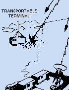
As a brief and unrelated aside, how long have electronic signals been depictedfranklin_experiment2 as jagged lines, as in the illo in the T/S post (from a training manual resource)? Did the very first broadcasting proposals employ this imaging of the invisible? Did the graphic serration derive from invisible but measurable waves, such as sound? Or could they have tapped an older graphic convention: the visualization of lightning. From late 17th-century meteorological tracts (bottom image in the link) to depictions of Ben Franklin’s electricity experiments, the jagged line has long been the trope. And of course older yet (petroglyphs don’t count, everything is up for interpretive grabs), but how far back?

h1

Helvetica metal

June 4, 2009

MOP

More evidence that workhorse sans serifs can transform even the humblest of thrash epics. This conceptual heavy metal graphic design project comes in the form of Metallica’s 1986 opus Master of Puppets processed in the title identity through the great leveler, Helvetica Franklin Gothic (see update below).

Noah Venezia, whose projects include the enigmatic Stupendous, has alchemically distilled the sleeve material of Master into a Swissly modernized poster. This approach isolates the text component of the album’s packaging, disorienting it in its degenrefication. It would be condescending to the original album to suggest this is an improvement; it’s apples to invisible oranges. (Master’s cover art was executed by the late Don Brautigam, whose Stephen King covers for Night Shift and The Stand, linger durably in my memory. Compared to what Ed RepkaDerek Riggs, and Joe Petagno produced the same year,  Master of Puppets is the quintessence of subtlety.)

The original vinyl Master of Puppets packaging (European issue), via Johan’s Metallica collection site

The original vinyl Master of Puppets packaging (European issue), via Johan’s Metallica collection site

Of the project Noah says, “Master of Puppets had a tremendous impact on me during my formative years. It was unlike anything I had heard and I became obsessed with it. People that I talk to either share a similar experience or it means nothing to them.

“My redesign of the liner notes was an attempt to glorify the album while also making it more acceptable to those unfamiliar. I wanted to compress it into a format that people did not question. I also wanted to make it more powerful simply by increasing its scale. It’s a sort of homage to the album.”

UPDATE: That is indeed Franklin Gothic. Though the main point adheres: it’s compelling to envision heavy metal through the conventions of modernism and clean type. And the pun in the hed is too good to ditch.

Noah says the poster will be on display at the new art + performance space Littlefield in the Gowanus neighborhood of Brooklyn on Friday, June 19.

Earlier: In lieu of a review: SUNN O)))’s Monoliths & DimensionsThe look of metal today

h1

ln lieu of a review: SUNN O)))’s Monoliths & Dimensions

May 17, 2009

sunncover

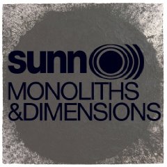
Given New York magazine’s profile of SUNN O))) upon the occasion of their Monoliths & Dimensions release, it’s fair to say that Doom, a formerly peripheral metal subgenre, has mainstreamed. A slight discomfort arose in this, and not just in recognizing myself in the predictable demographic slot of SUNN fans (musically omnivorous, mid-thirties, not seemingly a very metal dude). It’s the overprotective feeling fans get when their objects of devotion get that dreaded syndrome known as “exposure.” They’re going to get it all wrong, the avaricious part of the brain says. They may listen, but they won’t really hear.

I had the pleasure of previewing this album in a recording studio in DUMBO a few weeks ago. My professional interest in SUNN currently revolves around a piece I’m writing for Print magazine about contemporary heavy metal design, which will feature the graphic work of SUNN cofounder Stephen O’Malley, Isis and Hydra Head records frontman Aaron Turner, and designer/illustrator (and much more) Seldon Hunt. And though I no longer review music or profile bands, it was a music journalist preview, and old habits die hard. In lieu of an actual review, here are some impressionistic notes I took there as the multivalent and very loud currents of sound emanated from the well-calibrated studio monitors. The album’s nearly hour-long duration collapsed, and I entered an ambiguously deranged headspace. References below include: SOMA = Stephen O’Malley, Attila = Attila Csihar, former Mayhem vocalist and SUNN collaborator, and references to old-school industrial bands Coil, Laibach, and Skinny Puppy (surprising associations which SUNN fans may not appreciate). The notes below are numbered one through four corresponding to the album’s four tracks: Aghartha, Big Church [megszentségteleníthetetlenségeskedéseitekért], Hunting & Gathering (Cydonia), Alice—yes I just cut and paste those titles:

8 dudes and one girl waiting for doom.
Richard Serra as front over art. SOMA really going for the art
1. —midchord eruption like a lawnmower engine
chord progression actually faster than usual
Attila vocals from outer space. I think he said “Satan.” What other background chaos can come up against the guttural wall than the squealy-mouse running pick on guitar string effect?
-Laibach-
It’s turning into Scatology-era Coil, even Skinny Puppy atmospheres (“Reclamation”). Industrial undertones-noise
The horns, what are the horns?
-panicky @ that point
2. choral! Then the chord eruption-
two punctuated silences with bell. Abrupt end, just falls off a cliff.
3. like lo-fi SUNN coming over bad reception until-
horns very Fairlight–Coil, textures like “Cathedral in Flames”
* coming together on this one *
4. Modern classical tradition–horns dissolve, harp, plucked strings

Maybe that comprises a review after all. For more go check out interview transcripts from the world’s best music magazine, The Wire.

Earlier: The look of metal today