Archive for the ‘photography’ Category

h1

Win a David Maisel print for $20 and help a friend

March 27, 2010

Photographer David Maisel’s friend Meg Patterson was diagnosed with cancer in 2008. Meg’s friends are putting out the word to help her get the advanced integrative cancer treatment that her health insurance does not cover.

David is raffling off one of his amazing prints, “The Lake Project 38” (above), for $20 per entry. You can read more on David’s facebook announcement, but basically, for a chance at this original, signed 15″ x 15″ photograph, please send a $20 check made out to the “Meg Patterson Cancer Treatment Fund” to David Maisel Studio, 100 Ebbtide Avenue, suite 320, Sausalito, CA 94965. The deadline is April 15.

David says,

I will draw one of the checks randomly on April 15th, when the raffle will conclude. The winner will be announced on Facebook. Checks must be received by that date in order to be eligible for the raffle drawing. Checks received after that date will be returned. The selected person will receive the print from me by May 15. After the April 15th raffle drawing has concluded, checks will be deposited to the “Meg Patterson Cancer Treatment Fund” based in Astoria, OR 97103.

If you would like to increase your chances at owning this photograph, please send as many $20 checks as you please. (This is, after all, a fundraiser for someone who needs our help). And of course, in the spirit of offering your help to Meg, if you would like to make your check for an amount greater than $20, that would be deeply appreciated. (Please note that these are not tax deductible donations).

To read more about Meg Patterson, visit her site. To donate directly, without participating in the raffle, visit her Give Forward page.

Please permit the spirit of goodwill to commingle with your desire for an original Maisel print and send an entry/donation. Thank you in advance!

h1

Inversely proportional: thoughts on the future of the photobook

December 17, 2009

In honor of the passing of the great Larry Sultan, all the images in this post are from the book "Evidence" by Mike Mandel and Larry Sultan. This was the one that showed me the possibilities of the photobook.

This post is late in the game, but I hope it can be part of the networked blog discussion about the future of photography books started by Andy Adams of Flak Photo and Miki Johnson of liveBooks’ Resolve blog. I have been away from blogging and many other things normal people do thanks to an intense few months in graduate school. I want to weigh in on this subject, which, having been a photobook editor at a trade publishing house for ten years, is dear to my heart.  This experience will also reveal my biases, no excuses.

I havent read much of what the other bloggers have had to say so far, so as not to get buffeted by the winds of the discussion as it is in the moment. I suppose that is not so much in the spirit of dialogue, but after I post this I hope to read up and catch up. I expounded on the  topic of self-publishing and the future of photobooks in an interview Casey Gollan conducted with me at the Hey, Hot Shot! blog. I don’t want to be redundant with the points made there, but some of them bear repeating: for one, it is not primarily production quality, which will continue to improve, that holds the key to how photobooks evolve away from traditional publishing models. I think it is distribution, in its meaning now and probable future implications, which is the main consideration. By extension, distribution will be the key to how all books evolve in the future.

From the book "Evidence" by Mike Mandel and Larry Sultan.

There is a wide assumption that distribution is all about how the consumer will find books in the future, but that is only one half of it. The other half is obviously, How will the author/photographer find projects worth publishing, balancing the effort it takes to make a good book under any model vs. the number of consumers ready for it on the other end? The answer suggests a certain leveling: the “emerging” photographer can go his own way and create a fairly well-printed book with an unremarkable design and “publish” it to the tune of the few dozen contacts and fans from his MFA program and Flickr friends.

But what about the “established” photographer? Even if this is her first publishing venture, will she be content with this model? Will the institution or gallery who hosts her high-profile coinciding exhibition be content with a self-published catalog that costs nearly twice as much as other comparable photobooks, due to the economies of manufacturing on an ultrasmall print-run scale?

From the book "Evidence" by Mike Mandel and Larry Sultan.

Here Im suggesting that for all the duress the print publishing industry is under, a certain kind of patronage can keep the presses running. Those author/photographers for whom “a book” is not a single-minded goal, but who value all the aspects that come through the process—high-level creative collaboration, materials and production factor exploration, the reputation and history of the publishing house, fraternity with that publishers other artists, and yes, distribution—will be the ones making books with publishing houses.

Another point to reemphasize from the HHS! interview is that a huge drawback in the print-on-demand model is the lack of collaboration. Sure, never leave your workstation and youre still a blogger, music producer, filmmaker, etc. You are also a book publisher: the romance of the solitary genius. Whats lost here? The combination of differently specialized people bringing their expertise to bear on a project in the making. I assert that most books are multiauthored; from concept to object, several people—individually but interdependently—control the creative variables of the book.

The team that creates a book includes, but is not limited to, the author, editor, designer, and production person—and the manufacturers. Those Chinese guys that get slagged so much? They provide the majority of the color printing nowadays, and they are pretty brilliant at it. The point is that with mass-manufactured objects, which is what books are, sole authorship doesnt exist. Contemplating the book as product of an inspired photographer/editor partnership ignores the process of how the book was created in its materiality (though I will say—again revealing undeniable bias—the role of the editor is largely invisible, and often unacknowledged; thanks to Marc Feustel over at eyecurious for his insightful post on that very issue).

From the book "Evidence" by Mike Mandel and Larry Sultan

So for the next few years at least, I see a matrix of inversely proportional considerations in the trad publishing and the self-publishing models: I would chart them on x and y axes here for you, but I am a crap designer, so just viz it in your minds eye if you will.

Model I: The swarm. Increased access to self-publishing is inversely proportional to the consumers facility in finding books. In this case we see a market surge in photobooks, available through more sources (mostly photographers own web sites) than conventional distribution now offers. In the past a publisher’s list has been a scannable roster that  projects the publishers identity and is usually a handy guide to consumers who want a certain kind of book. In this model, the market is atomized and increasingly glutted; a subject search online is the principal way to find books, sucking any joy from the process. Or, someone undertakes a curated distribution center/online self-published book retailer, which helps the consumer browse books, but also helps establish and underscore a gulf between a trad-published book (even small run titles) that you find at, say, photo-eye, and the kind of book that for some reason doesnt seem to meet that standard.

Model II: Conquest of default formats, features, and materials. This graph is plotted with an increase in access to self-publishing on one axis and a decrease in variety of design and production features on the other. That is, the ascent of self- and print-on-demand publishing services coincides with the decline of exploration of the manifold materials and production possibilities afforded by most print vendors. I mean stuff many people will never noticedeckled edges, foil stamping, gatefolds, alternating stocks, thermoreactive inks,  and numerous other optionsbut which I believe make significant psychological impressions on them. These are not options that the top print-on-demand services offer. Will they some day? In principle, why not. Id love to go shopping—build a book online with a big menu of esoteric production options. However, even in bulk each of those features costs exponentially more than conventional ones, and in a small or on-demand run, the numbers are mindblowing.

These features are today exploited by the few clients who can afford them, and will in turn charge accordingly on the purchase level. They are largely available to the elite publishing stratum who work with the minority of manufacturers who can afford to offer them (through volume discounts from the batch buys which can keep supply chains open to specialty materials). Fewer publishers equals fewer experienced production managers, and therefore a decrease in exploration of the production and design opportunities overall.

From the book "Evidence" by Mike Mandel and Larry Sultan

Or maybe I am dead wrong about all this. In which case we could see Model III. The punk era of books finally arrives (this is pretty much the bright side of Model I). Increase in self-publishing begets a scrappy new stratum of publications, unleashing the creative potential of artists previously locked out of traditional publishing. This could be the cusp of a kind of golden era, where all kinds of artists, naïve to the traditions and conventions of the photobook, create a boom in coarse but fascinating publications. The market begins to resemble the chapbook section of City Lights, or a record store. This would be a flowering of outsider talent that really comes from the ground up, not self-conscious production and design slumming, like the newsprint formats of  Grant Willings Svart Metall or Alec Soths Last Days of W., or Ari Marcopouloss photocopied The Chance is Higher, or Michael NorthrupBeautiful Ecstasy, compulsively guttered by the excellent designer Paul Sahre (all of which I love). The brand concept migrates from the publisher to the photographer, and as with so many things we find new filters for an increasingly atomized scene.

And through it all, books with pictures of  dogs and cats continue to drive sales.

h1

Massimo Cristaldi: Simulacra

September 28, 2009
From the series <i>Simulacra</i> by Massimo Cristaldi

From the series Simulacra by Massimo Cristaldi

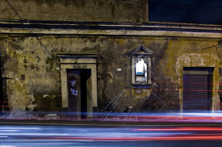
Massimo Cristaldi’s Simulacra depicts small-scale religious edifices in silent, nocturnal composure. Taken from an impersonal middle distance, the Sicilian and Southern Italian roadside shrines in these pictures are humble, sentinel. The icons within them are unseen, even preempting visibility with their own interior glow.

From the series "Simulacra" by Massimo Cristaldi

From the series Simulacra by Massimo Cristaldi

Whether freestanding and bound solidly to the earth, or tucked into massive exterior walls, these votive structures yield to Cristaldi’s subtle exploration of their latent luminous qualities via long exposures. There is a sense of loss, perhaps less religious than cultural, allowing to “galloping globalization and by general indifference,” as Cristaldi writes. Cristaldi adopts Baudrillard’s elaboration of simulacra as the theme of this body of work. Here there are levels of both representation and simulation (which Baudrillard distinguishes among): the subject of the photograph is an edifice to an invisible God (or Mother or saint thereof). In this respect, Cristaldi writes, “these photographs are simulacra of simulacra.” (To this one could add an additional level: the architectural. Comprised as much by the negative space of the arch as the columns which describe them, and topped by munchkin pediments, these structures are caricatures of classical architecture in miniature.)

simulacra-15

From the series Simulacra by Massimo Cristaldi

The tracery of automobile lights disorients the reverential purpose of these structures—they are little more than road markers. But Cristaldi also creates an additional irony: the head- and tail-lights describe numinous orbits around the shrines. These cars may be the last angels attendant to the divine.

simulacra-18

From the series Simulacra by Massimo Cristaldi

Simulacra was recently been awarded an Honorable Mention by the International Photography Awards, and the New York Times recently included his web site in its round-up of compelling photographers sites. Equally oblique and haunting, for the human tragedy which he addresses, is his suite Lampedusa (Wrecked Dreams).

h1

What the picture you’re looking at looks like

August 27, 2009

Tardy to follow up the “truthy lies” post with more opinions from photographers of the built environment, but never too late. In the intervening time, Edgar Martins broke his silence, citing Michael Jackson’s death, realizing that history is now unlinear, stating all facts are mediated, and referencing  Lacanian “lack”—all with only ten footnotes. I was back in Crit Theory class, circa ’91. Jörg published Edgar’s elaborate disquisition, then got a bit defensive for having afforded Edgar a one-way avenue for so little net explanation.

I’m guessing that the reason that this is all we’ve heard from Martins directly on the subject (long as it was) is to get to the other side of some kind of settlement with the Times. Regardless, when I read in a recent Sunday edition a little piece about photographic fakery, the irony was a tad too rich. A Dartmouth computer science professor (and fake photo sleuth) says, “The very nature of photography was to record events. . . . You’d think there would have been a grace period of respect for this new technology.”

I’m partisan on this issue, but this is an absurd statement for anyone familiar with the history and theory of photography. The science was born with a specific set of technologies so unlike contemporary faculties that we’re practically talking about two different practices. The ostensibly inviolable link between truth and photography cannot be traced to its earliest origins; the first Daguerreotype to depict a human famously records only the stationary man getting a shoeshine—the rest of the throng is invisible due to their motion over a long exposure. Photography’s preoccupation with mystical concerns throughout the nineteenth century, not to mention the photographic revelation of objects and events unobtainable to the unaided human eye, renders this line of thinking ridiculous to me.

As with many topics this can be qualified by intention and context. So here are several more photographers (and one “image creator,” see below) of architectural subjects and the built environment responding to the extremely reductionist question: Should photojournalistic standards of “truth” be applied to architectural photography? First there is Greg Girard, whose documentation of Kowloon Walled City is in my mind a major landmark in the history of architectural photography; his more recent book Phantom Shanghai is also amazing. Stanley Greenberg is arguably the foremost photographer of New York City infrastructure, and whose first two books will soon be joined by another next year, Architecture Under Construction.

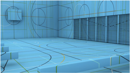
Philipp Schaerer has a different creative and professional profile than Greg and Stanley, as he is not a photographer, but an architect, image manager, and ultimately, as he terms it, an “image creator.” His field is architectural visualization, and he has done so professionally for such firms as Herzog & de Meuron. His conceptual projects include Raummodelle, which explores “how conceptual images can be developed with classic rendering techniques” and Bildbauten, which collides disparate elements of buildings and terrain to create images of impossible and meaningless architecture. Visually and conceptually his work is fascinating, and explicitly treats these big issues. So without further ado:

Greg Girard:

Neighborhood Demolition, Fangbang Lu, 2006, by Greg Girard

Neighborhood Demolition, Fangbang Lu, 2006, by Greg Girard

I’m not sure that photojournalistic standards of truth have even been applied historically to much of photojournalism, let alone other areas of photography. I am thinking especially of the staged and lighted pictures from Life magazine in the 1950s and 60s, among other earlier and later examples. At some point along the way a code of what constitutes acceptable darkroom manipulation and photographer intervention was established by the “quality” magazines and newspapers. This code remains in place today, modified for the new digital reality, though unless one has a background in mainstream journalism one would not really know what lines can and can’t be crossed. “Photojournalism” is a pre-television term, and in one sense the practice has never fully come to terms with television, let alone the internet and digital imagery. It seems that an ever-smaller number of these quality/traditional publications and their online versions enforce a code of standards, essentially a pledge to their audience that: “This is what we say it is.”  Without that pledge all you can say about a picture, in terms of truth at least, is: “This is what the picture you’re looking at looks like.”

Walled City Exterior, 1987

Walled City Exterior, 1987 by Greg Girard

Stanley Greenberg:

Untitled, Cambridge, Massachusetts, 2001, © Stanley Greenberg

Untitled, Cambridge, Massachusetts, 2001, © Stanley Greenberg. From the forthcoming Architecture Under Construction, University of Chicago Press

While I am scrupulous about issues of accuracy and manipulation, I think it’s all about your intentions, either stated or implied. I don’t alter anything at the site of my photograph. I may dodge and burn to bring back what I remember (and how accurate is that) because film is not the same as your eye. If I photograph an interior with a window, it’s a safe bet that you can see through the window with your eye, but the film may not have the latitude to do that. If you were to shoot digitally and combine two exposures to make a picture more like what your eye sees, that’s fine. But I’m not comfortable with adding a tree that’s not there. I don’t consider my work documentary; even if it is done in that style. There are so many ways you can alter perceptions; what do you include, what lens do you use, how do you light the space, can you tell what the scale is?

Architectural photography often means using a stylist to set up a scene. Is the photograph an accurate depiction of what’s there? Yes. But it may not be an accurate portrayal of how a house is lived in. And if you’re calling it photojournalism, you should be faithful to what’s there.

There are many ways of telling the truth. A fictional film may be a better way to tell a story than to use the facts. A novel may be better than a memoir. It’s all about your intention. If you state it, then you have a responsibility to be true to it. If you don’t, then you may leave it up for interpretation. But context can change everything, and you can mislead just as easily by locating your pictures in a way that is bound to be misinterpreted.

xxx

Untitled, Denver, Colorado, 2005 © Stanley Greenberg. From the forthcoming Architecture Under Construction, University of Chicago Press

Philipp Schaerer:

Bildbauten No 6, 2007

Bildbauten No 6, 2007 by Philipp Schaerer

It’s an interesting and a difficult question, and hard for me to say yes or no in very clear manner. Let me explain:

I think it’s already difficult to talk about “veracity” and “truth” in the field of photography. Taking a photograph is to project a tridimensional environment on a two-dimensional layer by means of a lens. Depending on the lens you use, the projection can be significantly distorted (as with a wide angle lens). In the field of architectural photography this fact is already problematic for [the intent of such] photographs is to reproduce truly the dimension of a space. How many times have we had the experience of looking first at a photograph of an interior—for booking a hotel room or looking for a new apartment—feeling a little bit disappointed once we physically were inside the space because it felt much smaller compared to the distorted photograph. So, already at this point it’s difficult to speak about veracity and truth in architectural photography.

Looking at the postproduction, the question is much more difficult, because at this moment of your workflow, you are able to erase or add supplementary content to the photograph or the image. The major question here is, at which level of intervention does a photograph lose its status of being a photograph? I do not speak of cleaning a photograph of dust and little scratches— that isn’t the problem. The problem begins when you are touching the content—when you alienate or change the represented content in the photograph. What does an architectural photographer do in the situation of having taken a shot of a façade and unfortunately there are distracting and accidental elements in the image, like a moving person, a car, or a temporary fencing which hides an important fragment of the façade and has nothing to do with the building. In this situation is the architectural photographer allowed to retouch the distracting elements without violating the “veracity and truth?” I would say yes, because one moment later the person or the car would have vanished and the retouched photograph would be the “same” as the photograph which would have been taken 3 seconds afterwards. . . . I know, already in this case the concept of photography as a “documentary piece of evidence” begins to alternate.

But what about the instances when architectural components are retouched and suppressed —for example a disturbing socket or a distracting division of a railing or a window? This phenomenon can be observed more and more since the onset of digital image editing. I can’t really say if this is good or bad, but I would like to understand why and wonder where it comes from. Most architectural photographs come into existence due to a commission from an architect. But architects and photographers deal differently with the reality. While a photographer is constantly busy to see what is there, capturing the environment like a “seismograph,” an architect is more trained to think of what could be there. For the architect, reality—built or not—always has something alterable, changeable. His building is a result of a long line of decisions, drawings, image montages, which throughout the design process [contains elements that can be changed until] the very last moment, when the building is built. I think this moment, when things become immovable, is a very delicate situation for the architect, because it requires a “change of mind,” another “mentality” about reversibility. For the architect a photograph is not really different than a drawing, an image montage, or rendering—it’s just another medium of representation, which also has the capacity of being changed.

I think it also depends on the context in which a photograph is highlighted and is used for. I think each photographer or image creator has to ask himself when doing his job and working on the postproduction, for what is this photograph used, and what is the main purpose—documentary or fiction? What level of integrity does the distribution channel or the final reader expect from the image?

Personally I’m only half confronted with the question of veracity when working on architectural images. I’m working in the field of architectural visualisation, [creating] images which are not to be seen as a copy of a certain reality; rather, they try to render/visualise an imagined, possible reality, because the buildings don’t exist yet. The only contact point between my work architectural photography is that I use a similar photographic visual language. Today, digital image processing allows the design of images that can hardly be distinguished visually from a photograph. This creates confusion. Architectural visualisations—as a rule designed during the planning stage—usually had a conceptual, abstract character. With the advent of photorealistic high-end renderings, a new kind of image type was added: an image that seems to be a photograph. It becomes increasingly difficult to make the distinction between documentary image as an image of reality, and a simulated, possible image. How do we as professional image creators react to this development?

My main interest does not really consist in providing images that are as photorealistic as possible. Visualisations are created in the stage where the freedom or the potential lies in the possibility to really express what is useful for the understanding of the project. So my main interest is: How can I create images which try to reflect not only a neutral, clean copy of a possible, built architecture, but also primarily convey an architectural idea based on the visual language of photorealism? By means of a selective handling of the image elements I try to maintain this balance; perhaps a certain degree of abstraction helps to distinguish between architectural photography (documentary) and architectural visualization (fiction). And this is good so.

Raummodelle No 4, 2008

Raummodelle No 4, 2008 by Philipp Schaerer

h1

The artificial infinite

August 21, 2009

Michigan&Delaware

SUCCESSION and uniformity of parts are what constitute the artificial infinite. 1. Succession; which is requisite that the parts may be continued so long and in such a direction, as by their frequent impulses on the sense to impress the imagination with an idea of their progress beyond their actual limits. 2. Uniformity; because if the figures of the parts should be changed, the imagination at every change finds a check; you are presented at every alteration with the termination of one idea, and the beginning of another; by which means it becomes impossible to continue that uninterrupted progression, which alone can stamp on bounded objects the character of infinity.

(Part Two, Section IX)

ChicagoMonoliths3

ANOTHER source of the sublime is infinity; if it does not rather belong to the last. Infinity has a tendency to fill the mind with that sort of delightful horror, which is the most genuine effect and truest test of the sublime. There are scarce any things which can become the objects of our senses, that are really and in their own nature infinite. But the eye not being able to perceive the bounds of many things, they seem to be infinite, and they produce the same effects as if they were really so.

(Part Two, Section IX)

Chicago_Architecture_20

Upon this principle of succession and uniformity it may be asked, why a long bare wall should not be a more sublime object than a colonnade; since the succession is no way interrupted; since the eye meets no check; since nothing more uniform can be conceived? A long bare wall is certainly not so grand an object as a colonnade of the same length and height. It is not altogether difficult to account for this difference. When we look at a naked wall, from the evenness of the object, the eye runs along its whole space, and arrives quickly at its termination; the eye meets nothing which may interrupt its progress; but then it meets nothing which may detain it a proper time to produce a very great and lasting effect. The view of the bare wall, if it be of a great height and length, is undoubtedly grand; but this is only one idea, and not a repetition of similar ideas: it is therefore great, not so much upon the principle of infinity, as upon that of vastness.

(Part Four, Section XIII)

From A Philosophical Enquiry into the Origin of Our Ideas of the Sublime and Beautiful by Edmund Burke (Harper & Brothers edition, 1860). Photographs © Alex Fradkin.

h1

Grant Willing: Svart Metall

July 31, 2009

claw

Grant Willing’s ongoing photographic series Svart Metall is a meditation on the ineffable qualities of an unsubtle musical subculture. “Svart Metall” is Swedish for black metal, and if you want to know more about that let me Google that for you. Though its sonic qualities are challenging even for some metalheads, its Nordic atmospherics and paganistic themes are arguably evocative for a diverse range of artists.

Grant created this body of work as his thesis at Parsons, and won “Best in Show” in the 2009 Photography Thesis Exhibition. He published it in an edition of 1000, also entitled Svart Metall, available through his site and Photo-Eye. The photographs are allusive of the themes black metal culture treats, and presented in a surprisingly informal way—printed on bleached newsprint stock (something of a trend? See Alec Soth’s The Last Days of W). On this ephemeral paper, the photographs retain a stately quality but gain a more disorienting sense.

Distinctive aesthetic expressions of metal are of interest on this blog, of course. But I also saw a (loose) parallel in how this American artist interprets visual genres forged in northern Europe and the original dissemination of the music itself, which spawned numerous stateside Black Metal bands. Overall I wanted to know more about  the motivations and process behind this fascinating body of work. I emailed Grant before he made a trip to Sweden and Norway to continue this series.

How did the project begin?

I was kind of stuck working on another project, Grand County [also viewable on Grant’s site] and felt like I needed to take a break from that. I had an idea for a while to do a project on Black Metal or something related to Norse Mythology, Paganism, Satanism, the Occult, etc. etc. I’d been kind of secretly fascinated with this stuff since high school and felt like it was time to do an “artistic investigation” into this.

I started actually working on the series when I took a trip in 2008 to Pennsylvania. I think I just had all of these ideas for different images coming through my head at that time and began shooting in that type of style and mindset.

moon blackmurder

I am interested in how relatively nonrepresentational and atmospheric the work is—which is of course consistent with a lot of the work that has appeared on black metal packaging. But it’s 180 degrees from, say, Peter Beste’s work [as seen in his book True Norwegian Black Metal].

I really like Peter Beste’s work and think its great how he does these intense studies into subcultures that have such a sense of awe or mystery surrounding them.  But yes, like you said, my work is totally different. I feel like his work is kind of the front-end of black meta—the performances of the musicians, how they want to look in front of the camera, carefully crafted situations, etc. My work is kind of like the back-end—what is behind the music.

Are you interested in Black Metal in all aspects, or just this aesthetic vector? That is, are you a fan who wanted to artistically explore this world, or is this new to you?

Like I said before, the series is a result of a long time interest in this kind of music and its ideologies. I’ve been listening to Metal for as long as I can remember, but when I started listening to Black Metal it was the first time it really interested me so much more than just the sound itself—the culture and history behind the music are what interest me most I think.

axe fortun

This was your Parsons thesis—and congrats on the award and fellowship. It was well received at school then? Who was your advisor? Any resistance to the project academically?

My advisor/professor for the past year at Parsons was Carrie Levy. She was incredibly helpful and gave me the best insight to my work that I received at school. Initially there was a small amount of resistance to the work mainly because we weren’t sure I was going to arrive at a resolved point in the work by the time I graduated. But this series developed a lot more quickly than some of my past work, I think because it’s something I had been thinking about for a long time and a subject I was already obsessed with.

How do you see this work tying into the larger metal-oriented art scene, from the fine-art, Banks Violette end of the spectrum to designer/musicians like Stephen O’Malley and Aaron Turner? Or do you see your work as its own thing?

I definitely gained inspiration from those artists, especially Banks Violette, but I think my work differs in the actual subject matter I’m looking at. I think for the most part these other artists are making work that directly references metal genres, but my work is referencing more what is referencing the music itself. I’m using Black Metal as an umbrella term in a sense, as a way to group together these different ideas, such as Paganism, Satanism, Norse mythology, etc. into a concise body of work. When taken out of the context of Black Metal, Paganism and Satanism alone are fairly different from one another, but they are grouped together in the sense that they provoke a similar mental image and are “occult.”

whitesun blacksun

Curious that you are continuing the project in Sweden and Norway—were any of the photos from the first part of Svart Metall shot there? I’d guess not all of them—if any of them—were taken in Scandinavian countries.

None of the photos in the series have been taken in Scandinavia so far (with the two exceptions of the found images “Fortun” and “Mannduad”). I started working on the project in western Pennsylvania—the first image of the series, “Untitled (Moon)” was one of the first images made for Svart Metall. Almost half of the images were taken in the mountains of Colorado. The rest were taken in New York and Québec.

mannduad fire2

For that matter, since the project eschews a considerable amount of literalism anyway, why is it important to actually go Nordic with the next part of the project—or any of it?

I think its important to visit these areas, Norway especially, in order to bring a sort of change to the work and have almost a fresh start again. It’s also undeniably something I want to do regardless of the work I make there—but my main objective is to see these places that have sparked what is essentially behind or responsible for provoking the rise of Black Metal, its culture, etc.

How do you plan a trip like this, how do you do location scouting ahead of time? Do you know what you are looking for, or do you go more instinctively?

I’ve only planned this trip so far in that I’ve booked train tickets to a few different places in Sweden and Norway. But mostly I’m going on instinct and off of some research I’ve done. It’s similar to the way I would shoot in the US: I choose an area based on the connotations it has or my impressions of it and use those ideas to find something in that place. So in a way I have ideas in my mind that I’m looking for, but they’re not necessarily location specific.

ice fenrir2

You are still working on Svart Metall; what are your ultimate plans for the project?

My ultimate plans right now are to keep transforming the series into an even more personalized look at black metal. It’s a really general desire, but I don’t want to pin down too much where I want it to go, I think it works best when it evolves naturally. I have a few ideas in mind of where it could go in terms of presentation, etc. but I’m hoping those ideas will also change over the course of the next year or so.

sword
The photographs above are not titled in the Svart Metall book, but they are, in order here:
Untitled (Claw)
Untitled (Moon)
Untitled (Black Murder)
Untitled (Axe)
Untitled (Fortun)
Untitled (White Sun)
Untitled (Black Sun)
Untitled (Mannduad)
Untitled (Fire II)
Untitled (Ice)
Untitled (Fenrir II)
Untitled (Sword)

Earlier: Helvetica metal, The look of metal today

h1

Truthy lies: photographers speak out on Edgar Martins

July 23, 2009

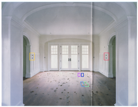
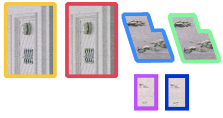
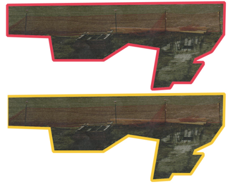
<i>Photo District news</i> identifies "evidence of manipulation" in Edgar Martins' photographs.

Photo District News further identifies “evidence of manipulation” in Edgar Martins’ photographs.

The Edgar Martins episode may be fading quickly, but the underlying issues won’t; they predate the digital era and will outlive the current edition of Adobe Photoshop.

What has interested me in this kerfuffle is how it has revived what I thought were fairly settled debates around image manipulation—er, alteration. Postproduction??—but this hunt for some morally neutral, aesthetically precise vocabulary to merely describe a commonplace photographic process reveals a persistent and deeply ingrained prejudice against it. (The editors’ note on the Times site itself betrays this rhetorical delicacy: “Editors later confronted the photographer and determined that most of the images did not wholly reflect the reality they purported to show.”)

Of course it was Martins’ assertion that he doesn’t employ such techniques, paired with a flagrant violation of the New York Times’ ostensible photojournalistic objectivity, which raised clucking disapprobation (as well as the slackness of the work, which is also pointed out in tones of disapproval). But I am still surprised that the “fixed image”—a term that harkens to photographic darkroom practice, when the image is chemically stopped before it flees—is still regarded as a sacrosanct artifact, even today, even among an increasingly visually literate populace, much less people who for better or worse spend time thinking about aesthetics.

But as a non-practitioner, I think my opinion counts only so far in this discussion, so I turned to several accomplished photographers who have dedicated commercial, editorial, and art-practice work to architecture. But like every debate, this one needs to be framed, so I contrived a question as essentialized as I could (though I also admit the question itself harbors a bias): should photojournalistic standards of “truth” be applied to architectural photography? So please read the responses below from Alex Fradkin, Tim Griffith, Mark Luthringer, and David Maisel, each of whom probe at these very issues in their own intelligent and diverse photographic work. I hope to post opinions from more photographers shortly.

Alex Fradkin:

My first reaction when seeing the images that were altered by Edgar Martins was not one of having been scandalized, deceived, or my questioning his ethics. Instead, when comparing the original and the final images that ended up in the Times Magazine, I wondered why he chose to make the images less compelling, by making them perfectly symmetrical. I have always like Martins’ work, still do. His photographs clearly belong in the fine art genre and not photojournalism. His work in my opinion has never been about depicting reality. I see his work as using what is “real,” as a departure point for the open-ended narrative of fiction and surrealism. Juxtaposing Martins’ images, with his established aesthetic is inherently problematic. Additionally, Martins’ should have understood that his images would be accompanying a journalism piece in a magazine that has a very clear stated policy regarding manipulated images. The Times Magazine’s stated guidelines are not difficult to interpret. To make matters worse, the Times described the project as not being digitally manipulated.

Architectural photography has varying rules regarding digital manipulation. Most magazines have stated policies outlining these policies. When commissioned by a client, the architectural structure is depicted in its most complimentary light and composition, where visual clutter and tones are adjusted. The boundary from photo to digital illustration is often crossed resulting in an image that looks more like a hybrid photo/computer generated image. In fine-art architectural photography, anything goes. Just be clear and consistent when asked if the image has undergone digital manipulation.

In the case of Martins, who probably does not see himself as being bound by “journalistic standards of truth,” and possibly even a little dismissive of those standards, ended up being commissioned by a magazine that is often a lightning rod for those who question the veracity of popular news media. Simply, a very poor choice on his part added to his being published in one of the most sensitive and visible media outlets. If his images had shown up in an architectural magazine, this controversy probably would have never materialized. If these images had shown up in fine art architectural book or on a gallery wall, the mirrored and partially duplicated parts of the images would have been seen as part of the artist’s intention. The discussion would then have focused on fictional narratives and the inherent meaning of what was intended by the photographer.

His comment about not employing post-production techniques was made over a year ago and to my knowledge has not been restated. Change and experimentation are an artist’s prerogative and part of the recent controversy surrounds that statement he made in 2008. Clearly he has changed this policy, but has made an unfortunate choice in the wrong venue to show his new methodology. Comparatively egregious, the alterations degraded the final works and were somewhat amateurish and easily spotted. At least if you are going to fall on your sword, make it for a truly worthy cause and do it well.
PDNsleuthing2

Tim Griffith:

In the book Architecture Transformed: A History of the Photography of Buildings from 1839 to the Present Cervin Robinson and Joel Herschman described a period in which the photography of built form diverged into two distinct camps. The pragmatic, documentary style exemplified by the likes of Walker Evans on one hand and the more aspirational, suggestive imagery of Hedrich Blessing, Ezra Stoller, and Julius Shulman on the other. Modernist architecture was just gaining a foothold in the United States and needed strong visual representation to help “sell” it to the wider public. The compelling images of sleek factories, elegant civic projects and bright, open residences were instrumental in driving the popularity and general acceptance of this architecture.

These were crafted, commercial images, made with a particular outcome in mind. Their role was to do more than merely inform the viewer of the building’s existence. They gave voice to the promise of a better future. A sleek, modern, prosperous new life.

But can these images be considered “truthful”? Depends who’s asking.

Even in this digital age, the initial act of choosing where to place the camera can be as politically charged as any amount of retouching or outright fabrication of specific elements with the frame. A potentially controversial design can be softened by selecting a flattering angle, choosing a flattering time of day, including more or less of the surrounding context. This is considered normal practice for an architectural photographer.

The majority of commercial architectural photography is commissioned by those with a vested interest in portraying the project in a good light. So photographers tend to seek solutions that satisfy that outcome. To do otherwise would likely shorten your career considerably.

With the easy availability of tools to digitally manipulate photographs, there is a certain commercial expectation from clients that some degree of “cleaning” will be undertaken during production of the final image. The words “we can fix that up later, right?” are becoming all too familiar. This “fixing” can either be handled by the photographer, or potentially by the client in-house. My preference is to control the retouching to ensure it is done within the bounds of providing a realistic representation. Realistic perhaps, as opposed to truthful.

One thing driving the widespread manipulation of architectural images is the commercial desire for finished views of the project well in advance of the actual completion date. Buildings are completed digitally so that marketing and advertising material can be generated. This manipulation is equally as applicable and important to museums and civic centers as it is for commercial developments and residential leasing companies.

Is this the actual truth as of this moment in time? Or can it be seen as advancing the truth, bring it forward a little? I mean the building will look like that, just not quite yet. And are these digital manipulations any more or less truthful than the computer renderings that had been used to represent the design through planning and construction?

The manipulation of commercial architectural images has become so commonplace that almost no other views of architecture are visible in our culture. Robert Elwell, in his excellent book Building With Light: An International History of Architectural Photography, suggests there are now only are two ways in which architecture is being presented to the world. The first is in the sleek, manipulated, politicized images made for commercial or marketing purposes. The second is within the fine art world where the architecture itself seems to be of much less importance than the artist making use of it as their subject. Elwell laments the time when photography played a more critical role in how architecture was represented, when there was some social commentary within the images on the appropriateness, or not, of new developments.

Realistically though, images that are less than flattering to architecture are simply not viable these days. They are potentially damaging commercially. They are less likely to get published by the design press that relies heavily on funding from advertisers with vested interests. No-one wants to see aluminium panels rippling badly in raking light. No-one wants to see the awful concrete rubbish bins along a facade because the developer/client was too cheap to purchase the ones suggested by the architect. No-one wants to see “For Lease” signs in a supposedly bustling retail center.

They want to see the constructed reality, not the truth. And as commercial architectural photographers, that’s what we get paid to provide. A friend of mine coined the phrase “really truthy lies.”

So to answer your initial question. . . . No. I don’t believe that a photojournalistic standard of truth can be applied to commercial architectural photography. To do so would make it unsustainable economically for the majority of those employed as architectural photographers.

So you can’t get architectural photographers to shoot the truth. As recently proven by Edgar Martins, you can’t expect a fine artist to tell the truth. I suppose you could get a photojournalist to shoot the truth but then perhaps, it becomes more about social context than about the architecture itself.

In any case, all three of these [kinds of] photographers can produce a version of the reality. Whichever one of the three is considered more truthful largely depends upon the inherent values of the particular audience involved. Clearly, the truth as accepted by the fine art world becomes increasingly fragile and dubious when held up to the wider scrutiny of a more cynical and hardened public.
PDNsleuthing3

Mark Luthringer:

No, generally speaking, I don’t think photojournalistic standards of truth should be applied to client work. They are pictures for selling, and as such should be enhanced as much as possible to make them into better pictures. Here it becomes a matter of taste and judgment. But a distinction must be made between making a picture prettier, sexier, or whatever, and actually fabricating structures, objects, etc. This is something I wouldn’t go along with, unless the client was specifically directing me. . . .

What bothers me about the whole Martins thing goes back to taste and judgment—Martins’ but more especially the NYT people. Surely [this is] very embarrassing for them (the digital work is very sloppy), but they are the ones who seem to want it both ways.

Maybe we can finally rethink the whole notion of having so-called ‘fine art photographers’ do editorial work. It’s a devil’s bargain and almost always a dismal outcome for each side (editor and photographer) in my opinion. If Martins is a ‘fine art photographer,’ then oughtn’t he be afforded wide latitude in his strategies and the kinds of images he makes? If so, then why is NYT hiring him for ‘journalistic’ work? To me, they’re idiots and have been for years. . . .

As for Martins, what does he hope to gain by all this cloning and stamping, mirroring and flipping? THIS is the ‘fine art’ in ‘fine art photography’?? Well, what is he supposed to do? His experience, and his imagery, show that he is coming up against the inevitable, the immovable, the inescapable, and that he knows there’s just not enough for him to do.
PDNsleuthing4

David Maisel:

There is no such thing as photographic truth, in architectural photography or any other kind of photography for that matter.

h1

What’s at stake when you make a picture in a public space

July 15, 2009
Magnum photographer Stuart Franklin asserts his right

Magnum photographer Stuart Franklin asserts his right

That the crown of the Statue of Liberty just reopened for the first time in nearly eight years is heartening, perhaps another small sign of the thaw in accessibility of public (and even historic and symbolic) places in the twenty-first century. Of course it’s not so much the restrictions on physical entrée that have signaled our compliance with post-9/11 command and control structures; what’s largely ignored are the mental battles—of images and their interpretations, of access to public space and full engagement with the environment we’ve built.

What obviously first comes to mind is the inverse propaganda, the successful curb on pictures of our wars and of soldiers’ coffins (a rule lifted by the Obama administration). But even closer to most of our experiences is the pervasive and baseless clampdown on making photographs in public and publicly accessible spaces. The reports of photographers being harassed, detained, and threatened with arrest are now legion (my favorite anecdote being Keith Garsee’s who was confronted by an enthusiastically ignorant security guard who cited something called the “9-11 law”).

Some cases received a lot of publicity due to high irony factors, such as when Duane Kerzic was arrested in late December 2008 by Amtrak Police for photographing a train at Penn Station. Why was he doing this? Because he was going to enter his photos of Amtrak trains a contest called Picture Our Trains—sponsored by Amtrak! The level of absurdity here is funny until a malevolent visage, still hard to shake, creeps into my mind’s eye.

There are a few things going on here, some of them explicable—if no less wrong—on account of human nature. But there is arguably another, more important level of struggle at hand, bound up in control over images and access to our built environment; if these rights are lost it will be through our voluntary and conscious relinquishment.

The first level is easy to figure out: after 9/11 we outsourced our rights. It’s not just the actual consequences of the letter of the Patriot Act, or the totally out-of-control Terrorist Watch List (now 1,000,000 names strong! Even if tens of thousands of those names are admittedly wrong). Worse than actual restrictions on freedom is the persistent perception of these constraints. To be clear: the Patriot Act did not overturn or even alter the First Amendment of the Constitution of the United States of America. Taking photographs on and of public property—and even most private property from the vantage of public property—is 100% legal. But somehow the post-9/11 environment has led people to assume this is not the case; ignorance begets ignorance. Almost everyone is to blame here: latent power complexes possibly harbored by cops, TSA employees, and private security guards are allowed to develop into full-blown petty tyranny in this climate. And otherwise sensible citizens routinely surrender in the face of such displays of power.
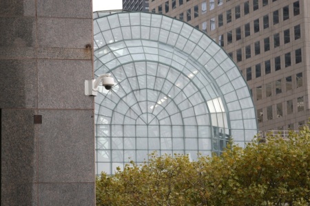
Surveillance cameras on the Mercantile Exchange Building, Battery Park City, New York. Shot from public space, though a guard tried to stop me from taking this photo.
Surveillance camera on the Mercantile Exchange Building, Battery Park City, New York. Shot from public space, though a guard tried to stop me from taking this photo.

From what I’ve experienced firsthand and observe anecdotally, a private security guard is a lot more likely to try to restrict lawful picture-taking than a cop. Cops get the law wrong too, but for the most part they know that if you are on public property you are free to make images (if not, and you’re in New York, remind them of the Operations Order issued in April 09 that photography is not a crime). Private, for-profit forces, here and abroad, took on security details with incredibly broad but entirely vague mandates, answering not to civil society, but to their bosses.

I acknowledge  the difficulty in making umbrella statements about this. But unless someone is going to try to enact and enforce legislation to register every camera and cellphone in the country, everyone has to admit the genie left the bottle long ago.  A Canon 5D with a 70-200mm lens makes no more real of a photo than the one taken with an iPhone. The photographers who get harassed are merely conspicuous, which is what anybody has a right to be when engaging in a legal and socially acceptable activity.

But the subtler level here, and why I think it’s important to not just raise awareness but actively resist these restrictions, is that we are all caught up in a grand struggle of ideas and images, and for the most part don’t even know it. This is a use it or lose it moment.

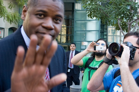
As Marshall Berman relates in his epilogue to “A Times Square for the New Millennium,” even innocent observation is too often mistaken for surveillance. In response, concerned photographers have created photog-mobs—organized picture-taking manifestations that overwhelm security and challenge their misunderstanding of the law.

Photo by NoHoDamon

Photo by NoHoDamon

The number of people raising their voices about this issue is growing. Cory Doctorow’s coverage at Boing Boing is very good, and individuals like Kerzic and Carlos Miller (Photography is Not a Crime) keep pushing the issue on their sites and directly to authorities. Matthew Williams satirically made fake licenses (1, 2) to present when prompted by out-of-touch security forces.

muni license

This isn’t just an issue for “professional” photographers; now digital cameras and cell-phone cameras are so pervasive, we are all arguably photographers. For many nonprofessionals whose interests lie in design and architecture, photography is an essential research  tool that helps record and understand our built environment. Beyond this professionally specific group, it is as important as ever for every citizen to feel engaged with their towns and cities. When this is lost, we tend to foster and tolerate places that aren’t worth being in. This is disenfranchisement of a fundamental kind: for the majority of the populace, the built environment is still what happens to them and around them—not what it feels it can create.

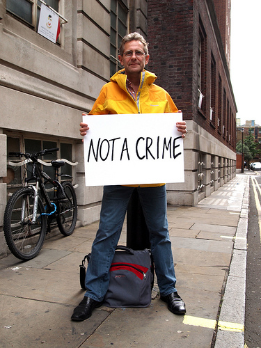
It is high time to rethink this. In a paranoid America (and UK, where our best-mates-forever have also been very assiduous in keeping their territory clear of potential photo-terrorists–there are many recent scary stories on the British Journal of Photography, an excellent resource overall), authoritarian control has crept further into our lives, largely by our consent. We have been too complicit in our newfound constraints. Go learn about an environment you like: find some public space and take pictures. And challenge anyone who tries to stop you to cite the law that prohibits photography. Know your rights and support new projects such as the newly launched Not A Crime: “Over the next year, we hope to gather thousands of self-portraits of photographers—professional and amateur—from around the world, each holding up a white card with the words: ‘Not a crime’ or ‘I am not a terrorist.’”

The operating philosophy here is that the biggest jail is in our own heads, and that a society gets the freedom it earns. Let’s turn it around.

h1

Prompts 7.3.09

July 3, 2009

HIStory teaser

° This tour teaser, shot in 1995 in Budapest, was directly referencing Triumph of the Will per MJ’s wishes. There is more footage rumored to be buried, and a little more here.

Hin Chua

° An amazing-looking, at times startling, photography show about food curated by Melanie McWhorter, and including the work of no fewer than three Hot Shots.

MGwithpage

° The difficult genius of Michael Gira now migrates from music and words to a twenty-drawing portfolio.

ebm

° “It’s been great for building community.” The vaunted Espresso Book Machine, blogged here earlier, is one of the last independent bookstore employees left. Check out the video, they managed to make print production rather dull. Via Ted Weinstein.

x_invite

° Adam Michaels of Project Projects launches X, a document of the trajectory of the X symbol within (and without) underground music culture. Exhibition is already over but phase one, a book of initial visual research, is available.

° Last, Darius Himes is always talking about what makes a good photo book. And is dead-on.

h1

Over stock

May 16, 2009

I liked the idea of a newsy visual index of the absurd list of goods and services claimed as expenses by rapacious British MPs in the mounting scandal. But this stock-image catalog is the wrongest way to do it.

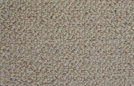
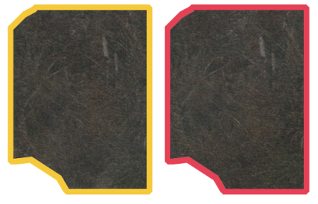
An intern at the Daily Telegraph thinks this unpatterned carpet swatch is a Persian rug.

An intern at the Daily Telegraph thinks this unpatterned synthetic carpet swatch might pass for Kenyan.

Newspapers can only thrive online if they exploit the medium intelligently. The list of expensed items here is itself outlandish, but all easily visualized by verbal description alone: toilet paper roll holders, tea lights, swag baskets, even helipad hedge-trimming. This piece hardly deserved the multimedia slideshow treatment, which merely revealed embarrassing royalty-free image purchases. Two swans for the moat-cleaning service? Dun-colored synthetic carpet for Kenyan rugs? Perhaps all the photo researchers at the Telegraph have been laid off?

Though on the other hand, there really is no good choice but stock for certain articles, such as the the recent news of airborne cocaine and acid in Barcelona and Madrid. But then, why the need to illustrate it at all?